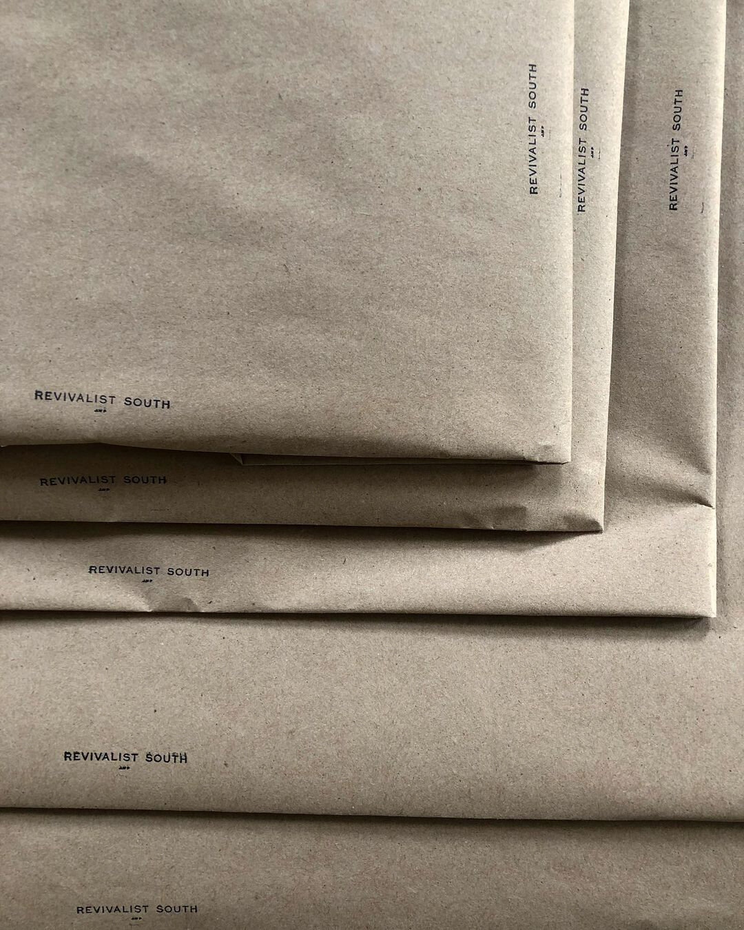
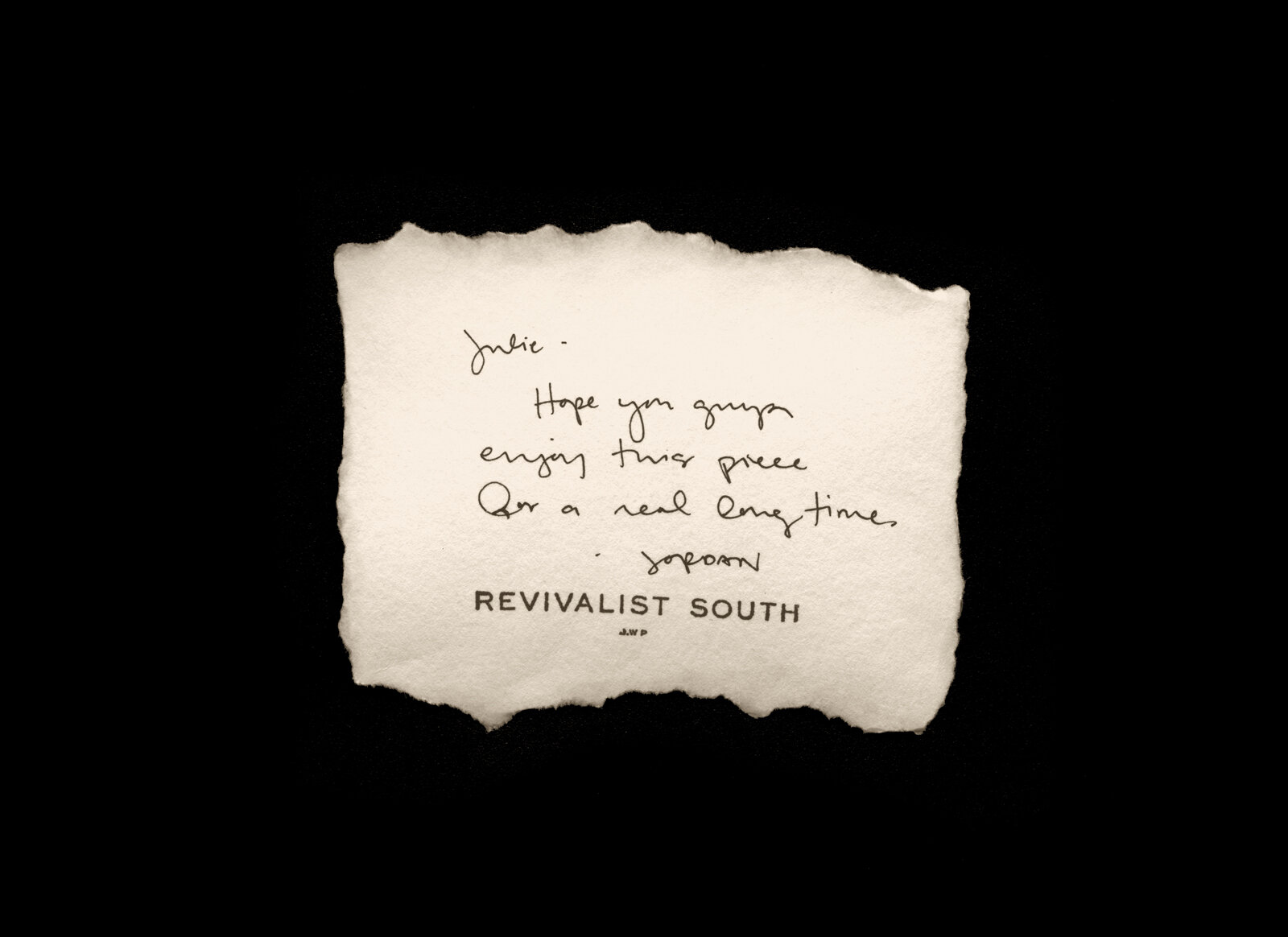
Revivalist South is the alias of Jordan Wright Patterson―the woman is synonymous with the brand, and since the artist's point of view is inseparable from the work, I sought to introduce her as part of the logo & identity. My approach involved focusing on the ways in which the brand should mirror the truth & authenticity present in the founder herself.
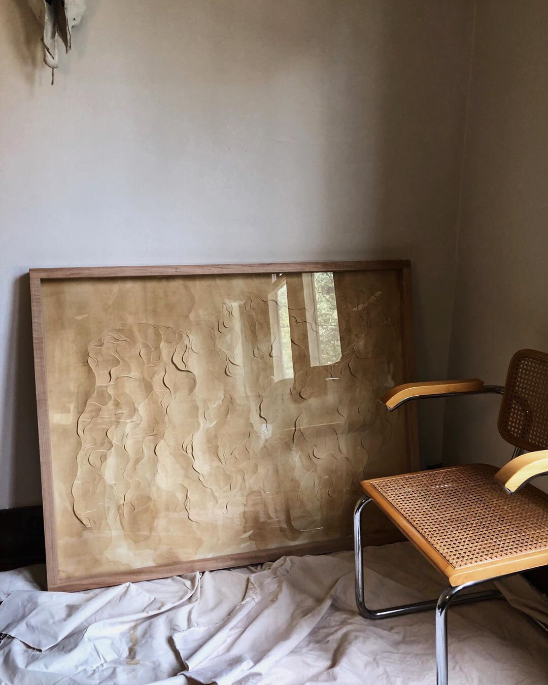
Jordan Wright Patterson is an Atlanta-based artist specializing in one-of-a-kind works on paper. Her process is both meditation and brutality: soft, organic shapes are cut and carved into hand-dyed papers, all at once minimal and intricate. I sought to replicate these aspects of her work in the logotype: each character was traced, distressed, scanned, refined, and distressed again to add an element of softness, warmth, and detail to a crisp geometric sans serif. The incorporation of the artist's initials adds a humanness to the brand and acknowledges the interconnectedness of these handmade objects with the hand of the creator.
I was commissioned to refresh the Revivalist South brand identity and create a more flexible visual identity system that centers the interchangeable nature of the creator and the creation.
Photography by Jordan Wright Patterson and Anna Howard.

